

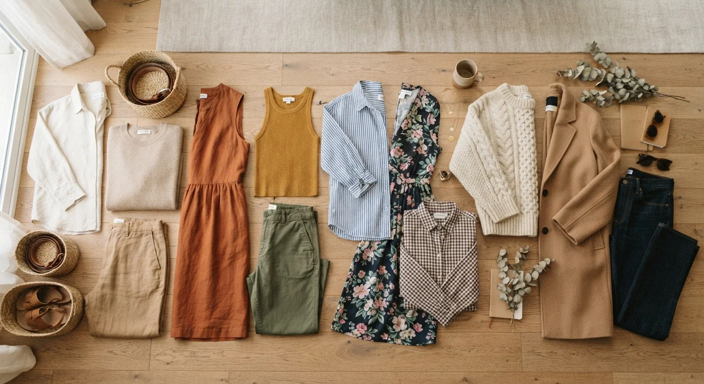
Key Takeaways
- Color is the most immediate visual signal your outfit sends — it sets tone before anything else registers.
- Patterns create visual movement and scale; mixing them well relies on varying size and keeping a shared color.
- Texture adds depth and dimension that flat photos often miss but real-world viewers immediately feel.
- You don't need trend-driven pieces to use all three elements — they work at every price point.
- A strong personal style often leans on one dominant element and uses the other two to support it.
Visual Language of Style
The visual language of personal style refers to the way color, pattern, and texture combine to communicate a mood, personality, or intention through clothing — before a single word is spoken. Just as written language uses letters and grammar, style uses these three elements as its core vocabulary. Learning to read and use them intentionally lets you dress with purpose rather than guesswork.
In color theory, hue (the color itself), value (lightness or darkness), and saturation (intensity) each affect how a color reads on the body and in combination with others.
Why Color Does More Work Than You Think
Color is the first thing most people register about an outfit — even before silhouette or fit. It sets emotional tone instantly: a cobalt blue reads energetic and confident; a dusty rose feels softer and approachable; an all-black ensemble signals polish or edge depending on the textures involved. Understanding why you're drawn to certain colors gives you a shortcut to dressing with intention.
One useful framework is thinking in terms of contrast level. High contrast — say, black paired with bright white or navy with cream — reads as bold and decisive. Low contrast combinations, like camel with tan or soft gray with blush, feel quieter and more understated. Neither is better; they just say different things. The goal is knowing which message you're sending.
Your skin's undertone can offer a useful starting point for color selection, though it's not a ceiling. For more on that distinction, see our guide on skin tone and undertone. And if you're building a wardrobe with a real budget in mind, focusing on a tight color palette — three to five colors that work together — stretches every piece further. More on that approach lives in our Budget Fashion hub.
“Color is a power which directly influences the soul. Color is the keyboard, the eyes are the harmonies, the soul is the piano with many strings.”
— Wassily Kandinsky, Painter and art theorist, known for foundational writings on color and form
Pattern: Scale, Mix, and Visual Movement
Patterns introduce movement and personality to an outfit. A stripe draws the eye in a direction; a floral scatters it softly; a geometric repeats with precision. Each creates a different energy, and that energy compounds when you combine pieces.
Mixing patterns is often treated as an advanced move, but the underlying logic is simple: vary the scale and share at least one color. A wide-stripe shirt paired with a small-check trouser in the same color family reads as curated rather than clashing. The contrasting scale prevents visual competition; the shared color creates cohesion.
Pattern also interacts with proportion. A large-scale print concentrates visual attention, while an allover small print reads more like a texture from a distance. If you're exploring how proportion and scale play into your overall look beyond just pattern, the article Why Knowing Your Body Shape Isn't Enough is worth a read.
90%
Of snap judgments about products influenced by color alone
Research published in the journal Management Decision suggests that up to 90% of an initial product assessment can be based on color — a principle that extends naturally to how clothing reads at first glance.
3–5
Colors in a cohesive capsule wardrobe palette
Style educators and wardrobe consultants commonly recommend limiting a working wardrobe to three to five complementary colors so that pieces mix and match with minimal effort.
Texture: The Element You Feel Before You See It
Texture is the most underused tool in everyday dressing — and one of the most powerful. It refers to the physical surface quality of a fabric: smooth, ribbed, nubby, brushed, shiny, matte. Even when an outfit is photographed in flat lighting, texture is what makes it feel rich or flat in person.
The most effective use of texture is contrast. A chunky knit sweater reads differently paired with sleek tailored trousers than it does with distressed denim — same sweater, two different stories. Mixing a matte linen with a subtle sheen in a scarf creates dimension that no amount of color-matching achieves on its own.
Texture is also where budget shoppers have a real advantage: ribbed cotton, canvas, woven fabrics, and brushed flannel are widely available at accessible price points and all bring tactile interest to an outfit. The key is buying intentionally rather than impulsively — something our Style Audit guide can help you practice.
Start With One Texture Swap
If texture mixing feels overwhelming, try changing just one item in an existing outfit — swap a smooth cotton tee for a ribbed one, or replace a flat canvas tote with a woven one. That single substitution often elevates the whole look without changing anything else. Small, low-cost swaps are a great way to train your eye before committing to bigger wardrobe changes.
Putting It All Together as a Personal Style System
The most cohesive personal styles tend to have a dominant element — a signature color family, a love of pattern mixing, or an all-texture-no-print approach — supported by the other two elements. That dominant choice becomes your visual throughline, making even new or inexpensive additions feel like they belong.
If you're still figuring out what your dominant element is, the process starts with observation: which outfits in your current wardrobe make you feel most like yourself? Look for patterns in color, surface, and print. That self-assessment process is exactly what Finding Your Style Identity From the Ground Up is designed to walk you through.
Once you have a working vocabulary — your preferred color range, your comfort level with pattern, your texture instincts — getting dressed becomes less about following rules and more about making choices. That's when style stops feeling like an effort and starts feeling like expression. For a comprehensive look at developing that vocabulary over time, The Full Picture covers the whole journey.
Style Rules Are Starting Points, Not Ceilings
Frameworks like 'vary pattern scale' or 'mix textures for depth' are tools, not laws. They exist to give you a foothold when you're building confidence, not to restrict what you can wear. Once you understand why a guideline works, you're fully equipped to break it deliberately — and that's where real personal style lives.